

DRIP cafe branding

Drip brews bold personality into every brand touchpoint — a vibrant identity inspired by the flow of creativity (and coffee).


From idea to…

-
With Drip my mission was to craft a brand identity that brews meaning — combining soulful design with the rich culture of coffee.
-
The vision of this project is to be able to show that every coffee brand, big or small, can drip (pun intended:) ) with personality — standing out through intentional design, organic aesthetics, and vibrant storytelling.
-
Working on Drip’s brand identity was like a breath of fresh air. I wanted it to be playful, fun, and full of personality! Therefore, Drip is not just another coffee shop identity, it’s a story, filled with love and joy.
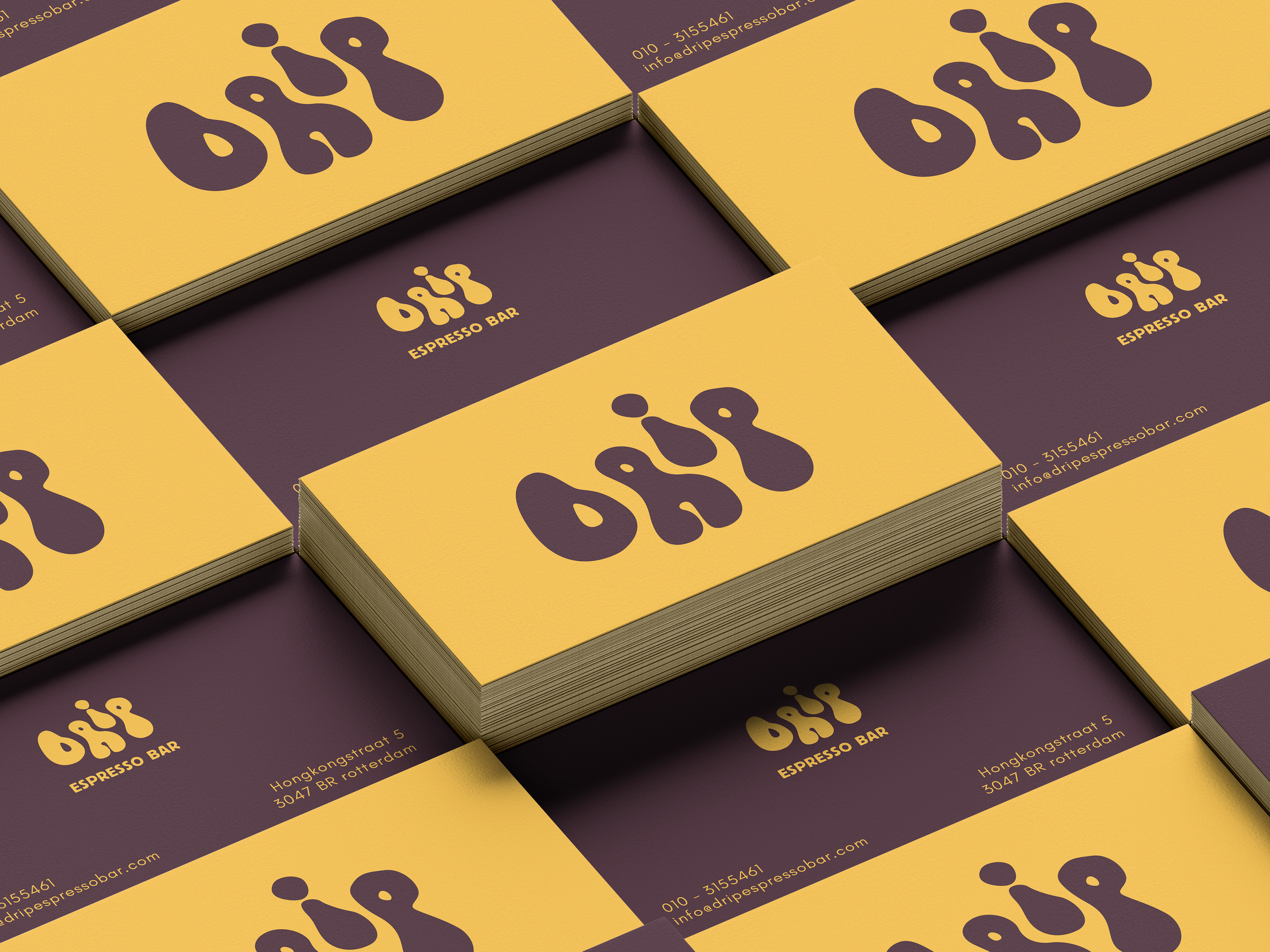
Colours: a vibrant fusion of warmth and personality — from creamy off-white and espresso brown to playful mustard yellow, and dark purple. This palette captures the bold spirit of modern coffee culture with a hint of retro charm, perfectly representing a brand that is both, grounded and full of energy.
Logo: the Drip logo captures the essence of slow, intentional movement — with fluid, wavy letterforms inspired by coffee droplets.
Font: Drip combines the bold charm of Block Berthold with the clean simplicity of Glacial Indifference. Block Berthold’s quirky, expressive forms give the brand a retro-inspired personality, while Glacial Indifference adds a modern, grounded contrast — striking the perfect balance between playful energy and confident clarity.
*Drip is a fictional brand


