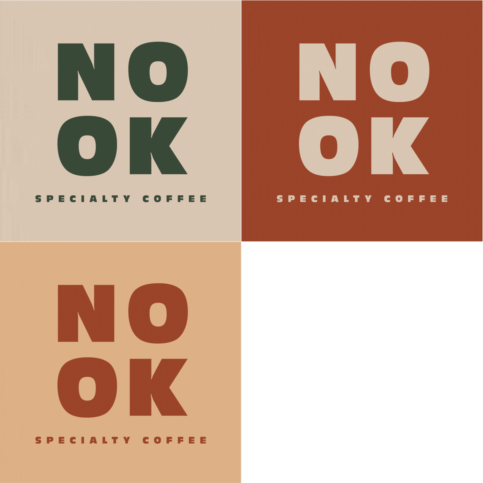
NOOK cafe branding

NOOK - a place where good coffee and coziness come together. Scroll down to explore NOOK and its products.


From idea to…

-
NOOK’s mission is to serve high quality specialty coffee and create a cozy, warm and inviting atmosphere for its guests.
-
NOOK wants to be seen as a place that feels like home, like that cozy corner everybody has in their own house. And next to that NOOK strives to be the provider of the best coffee in town.
-
An idea to create a branding for a coffee shop was spinning in my head for a very long time. Being a huge coffee lover myself, I always tried to imagine how my own cafe would look like. So, finally I decided to just go ahead and make the design. My goal was to create a brand that embodies both, coziness and quality. Therefore I chose quite minimal design, using soft, earthy tones and bold, striking typeface.
Colours like beige, dark green and brown very well portray autumn, which resonates with those cold, rainy days when all you want to do is cozy up somewhere with a warm, fresh cup of coffee and a good book or a show.
An illustration of a coffee tree branch connects the brand with the origins of coffee beans, this way showcasing the high quality of coffee.
And lastly, bold, thick lettering and logo makes NOOK appear strong and modern, appealing to the customers living in this age.
*NOOK is a fictional brand


